
Excel pivot tables are used to summarize and analyze large data sets. They allow you to quickly group and aggregate data and provide insights that might be difficult to identify from raw data alone. Here is an example of how to create a pivot table in Excel:
Suppose we have a sales data set that includes the date, product, sales region, and sales amount for each transaction. The data might look like this:
To create a pivot table:
- Select the data set and go to the “Insert” tab in the Excel ribbon.
- Click on the “PivotTable” button, which will open the “Create PivotTable” dialog box.
- In the dialog box, select the range of cells containing the data set, and choose whether to create the pivot table in a new worksheet or on an existing worksheet.
- In the “PivotTable Fields” pane that appears on the right side of the screen, drag the “Product” field to the “Rows” area, the “Region” field to the “Columns” area, and the “Sales Amount” field to the “Values” area.
- Excel will automatically create a pivot table that summarizes the sales data by product and region. The resulting pivot table might look something like this:
| East | West | Grand Total | |
|---|---|---|---|
| A | $100 | $180 | $280 |
| B | $120 | $200 | $320 |
| C | $250 | $250 | |
| Grand | $220 | $630 | $850 |
| Total | $440 | $1260 | $1700 |
The pivot table shows the total sales amount for each product in each region, as well as the grand total for each combination of product and region. The table can be further customized by adding filters, slicers, and other visualizations, allowing you to explore and analyze the data in different ways.
The pivot table we created in the previous example can be visualized using various charts and graphs to provide a more intuitive understanding of the data. One such visualization is a stacked bar chart. Here’s how you can create a stacked bar chart from the pivot table:
- Select the pivot table.
- Go to the “Insert” tab in the Excel ribbon and select the “Stacked Bar” chart under the “Charts” section.
- Excel will automatically create a stacked bar chart that visualizes the sales data by product and region. The resulting chart might look something like this:
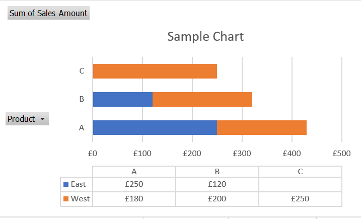
The stacked bar chart shows the total sales amount for each product in each region, and how that total is divided between the different regions. The legend on the right side of the chart indicates which colour corresponds to which region.
You can further customize the chart by adding data labels, changing the chart title, adjusting the colours and font sizes, and so on. The resulting visualization provides a clear and concise summary of the sales data and can be used to identify trends and patterns that might not be immediately obvious from the pivot table alone.